
The objective of this project was to redesign the official website for the digital music service, Spotify. I envisioned ways to refine the original design, and to enhance the user experience and aesthetics. I implemented these improvements through the creation of this redesign:

Here was the original website design:
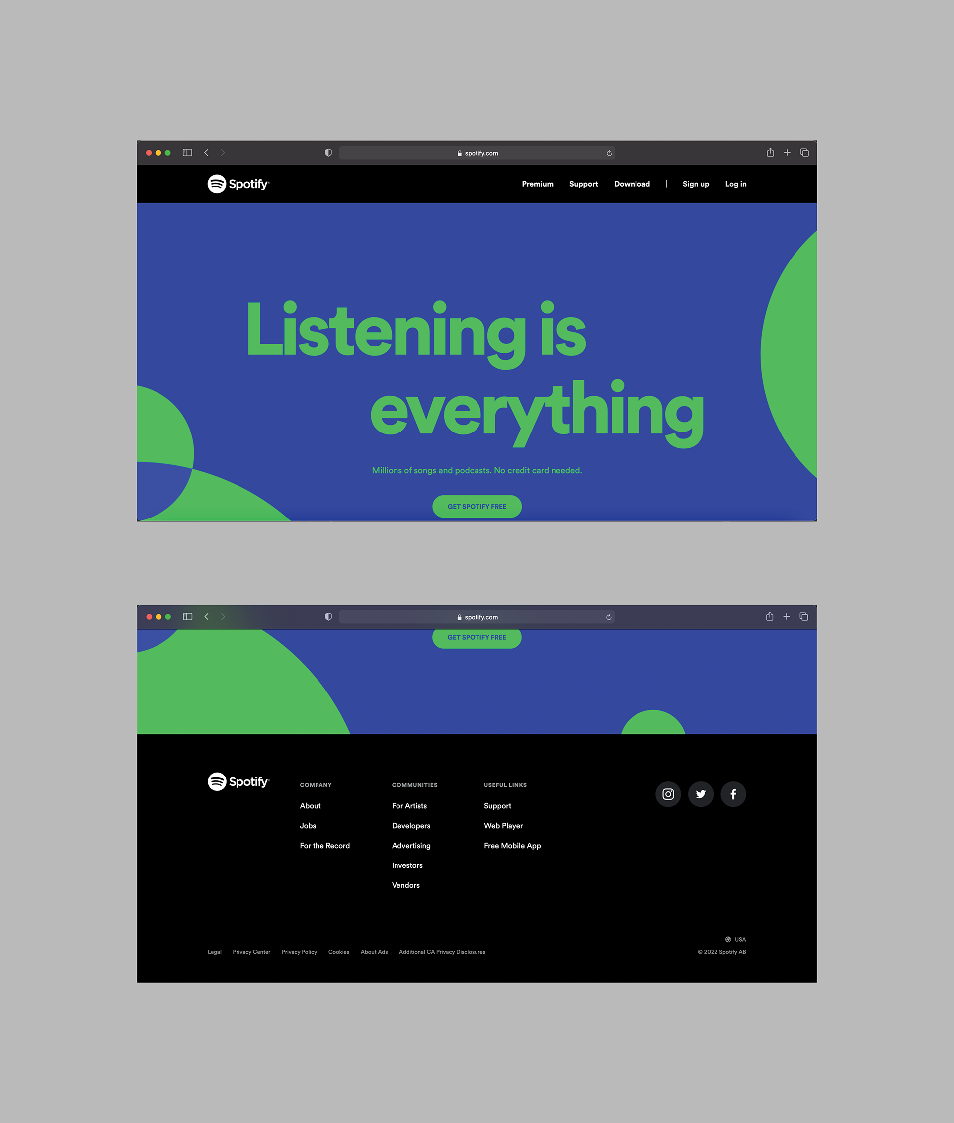
The original graphic in the page's main content features the vibrant lime green text "Listening is everything" and "get Spotify free", surrounded by four solid lime green circles all in a vibrant blue background. While initially delivering a clear message, I perceived these designs as flat and not very engaging, lacking the desired level of visual interest.
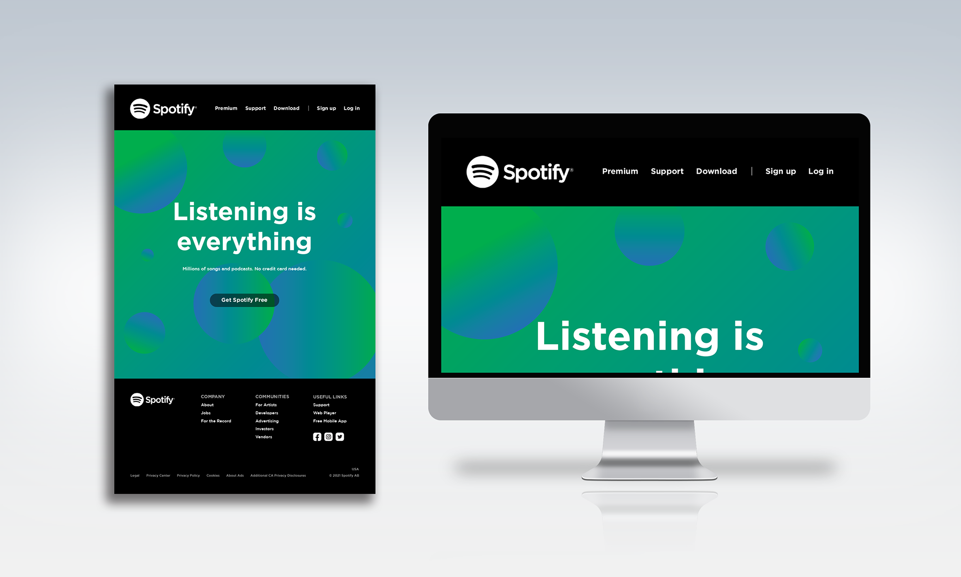
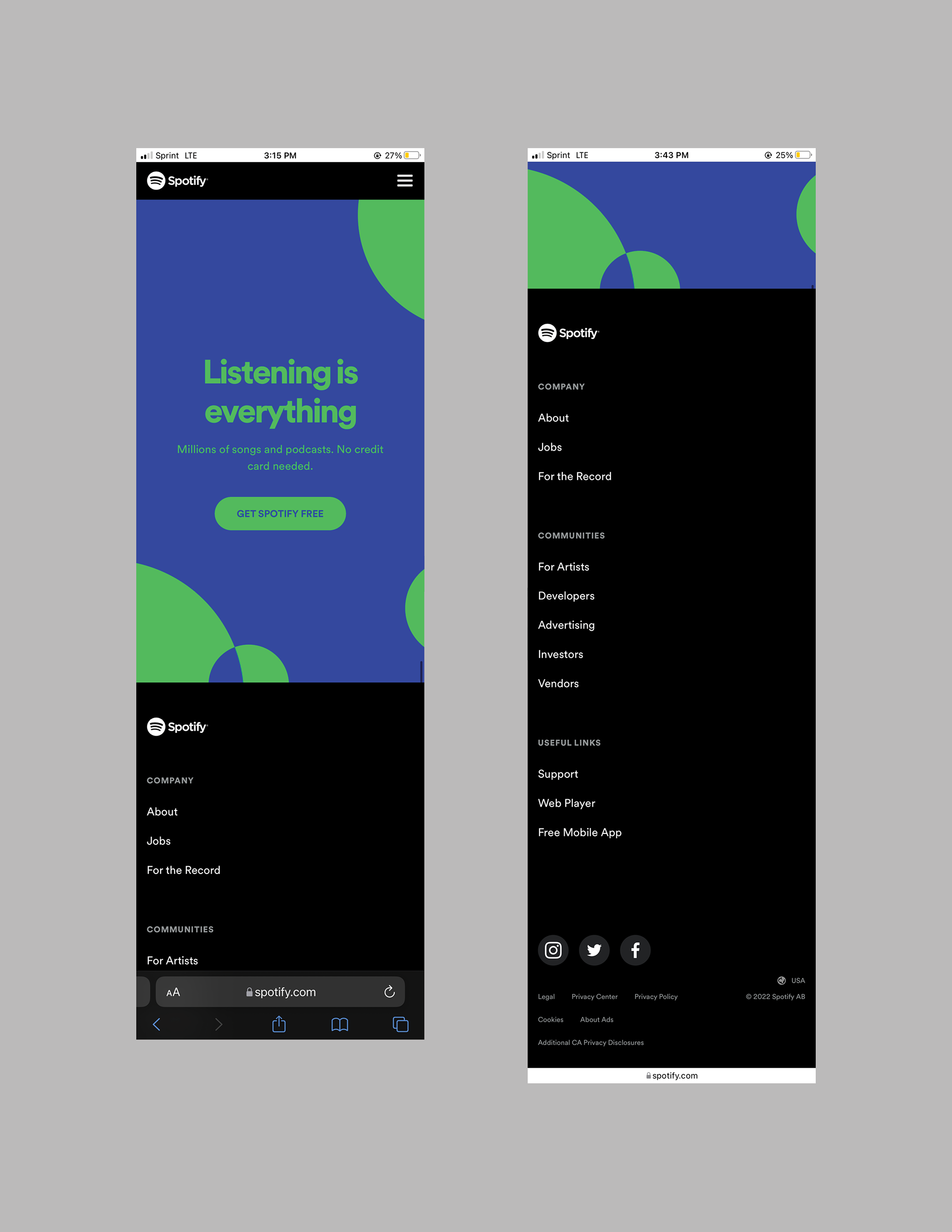
To enhance the aesthetic appeal, I introduced changes by adopting the original logo's green hue that transitions into a soothing blue gradient background. I also added more dynamically floating circle shapes, each with the same gradient of the Spotify green and the chosen blue shade. This gradient not only adds depth to the background but also contributes to a much more captivating and engaging design, while still staying true to the brand by incorporating the main Spotify logo's green color in a unique way.
Programs Used: Adobe Illustrator